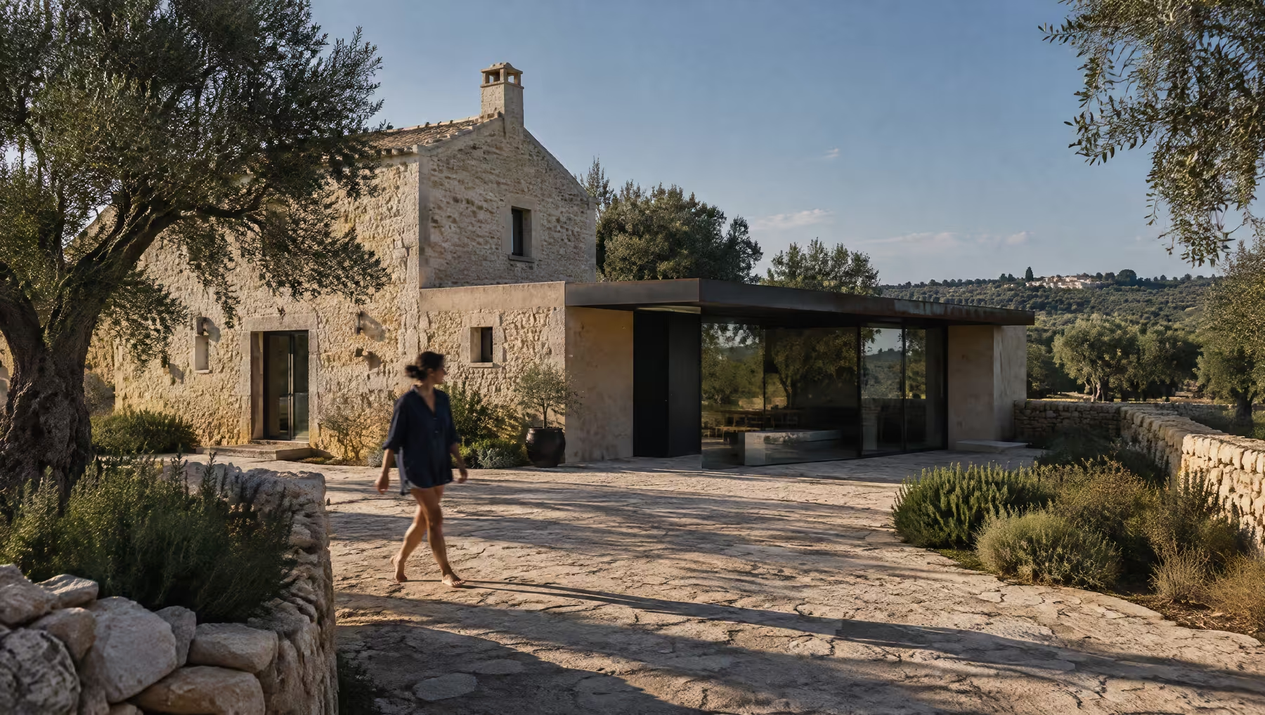
This document sets out our strategic approach to the identity, art direction and digital presence of Àltera.
The objective is to evolve Àltera from a beautiful place to stay into a recognisable hospitality brand: contemporary, rooted in Puglia and warm enough to be remembered.
It translates what we learned in discovery into a creative direction, and proposes three distinct territories for the identity to grow from.
- 01Overview
- 02Creative Strategy
- 03Visual Direction
- 04Next Steps
Brand Overview
01
“A contemporary place to stay that gives you a more personal way into Puglia.”
Àltera is an independent 18-room hotel in the Valle d’Itria countryside, between Ostuni and Ceglie Messapica. A restored nineteenth-century rural estate sits beside new low buildings in local stone, lime plaster, glass, steel and concrete.
In three years the hotel has grown warmer, richer and more culturally engaged: a seasonal restaurant, relationships with makers and producers, and a team that knows the region well.
The place has become more interesting than its brand.
What You Told Us
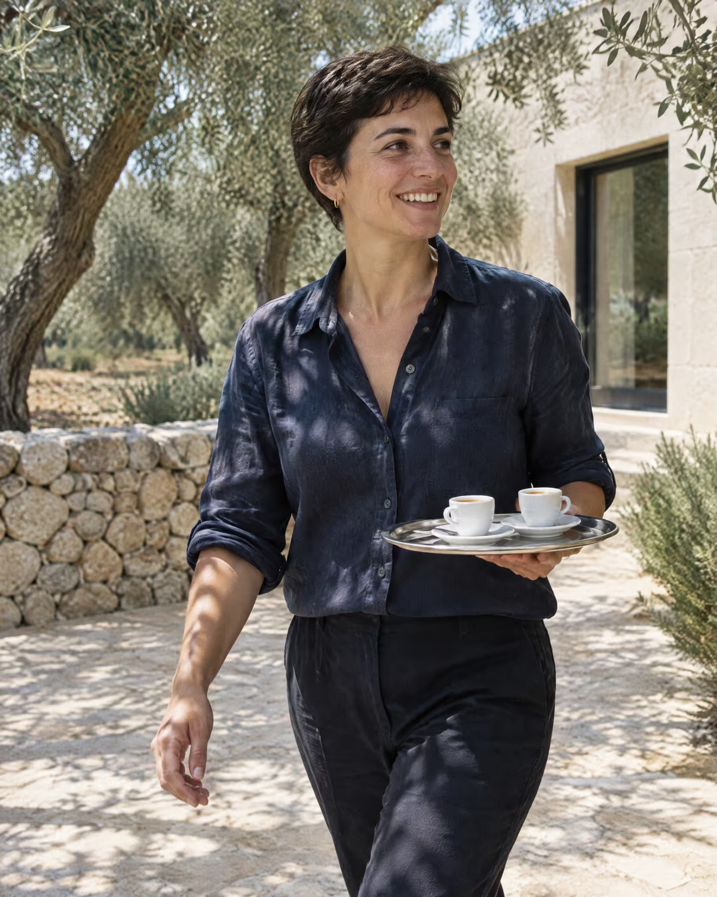
Years between Milan and London around fashion, art and architecture, then an abandoned estate that was interesting because it was not picturesque in an obvious way.
A hotel first. Puglia as a living place rather than an aesthetic, with design supporting the experience instead of becoming it.
The identity still tells the original, architectural story. The website is beautiful but emotionally flat: rooms and buildings, not why people love the place.
More direct bookings, a longer season, stronger international recognition and a few collaborations that feel genuinely relevant.
Mission and Why Now
Why Àltera Exists
To give guests a more personal way into Puglia: space, good sleep, good food and knowing where to go, from people who are looking after them without managing them.
The first identity and website were made quickly, alongside the architecture, so the hotel could open. They did the job. Since then food has become central, the team is stronger and guests come for the whole experience rather than the building.
The brand now needs to catch up with the place, before platforms and press define it for everyone else.
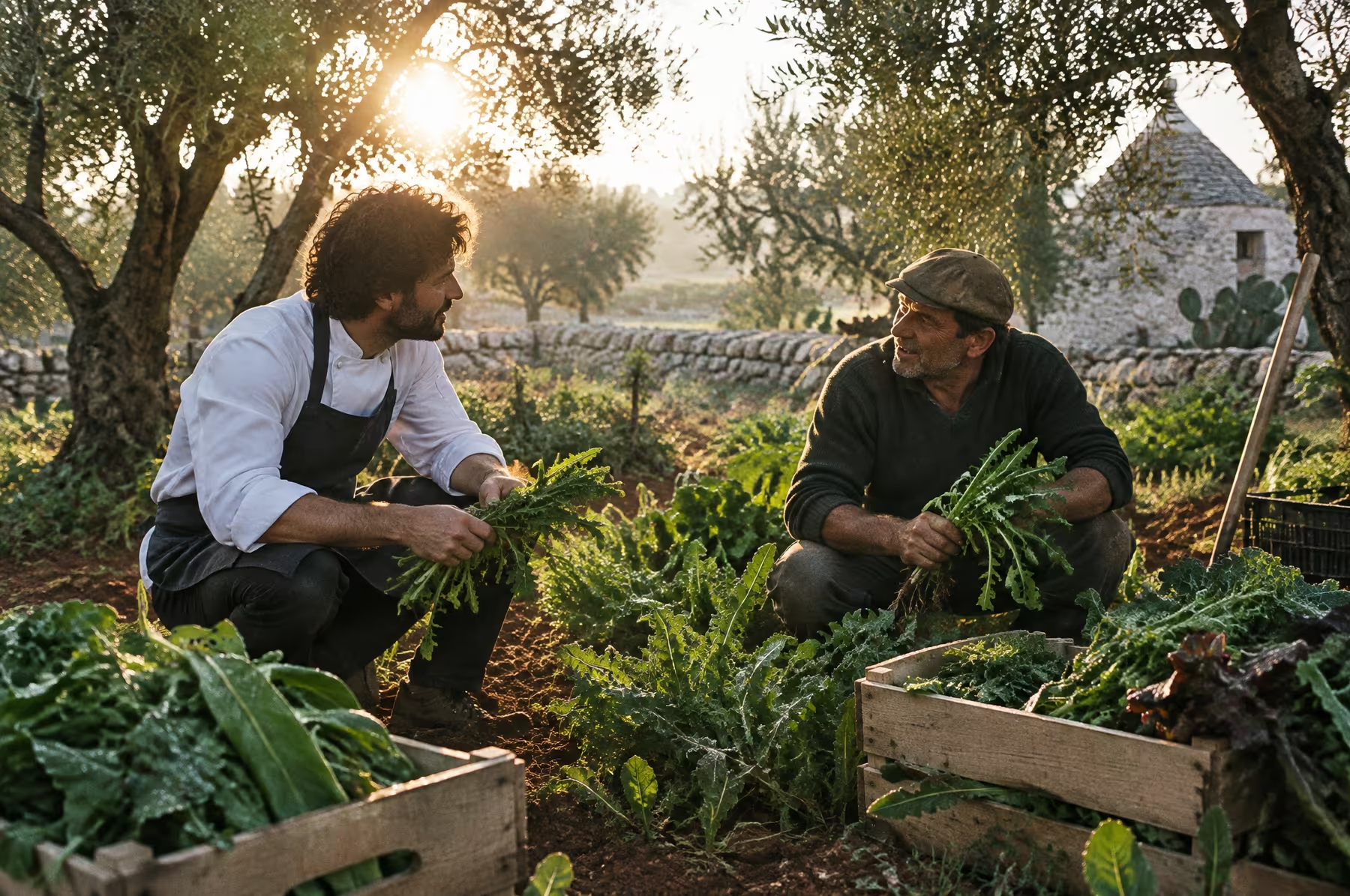
Considered, but easy.
What guests should remember, and what the brand should do: make people want to understand more of the place around them.
Brand Foundations
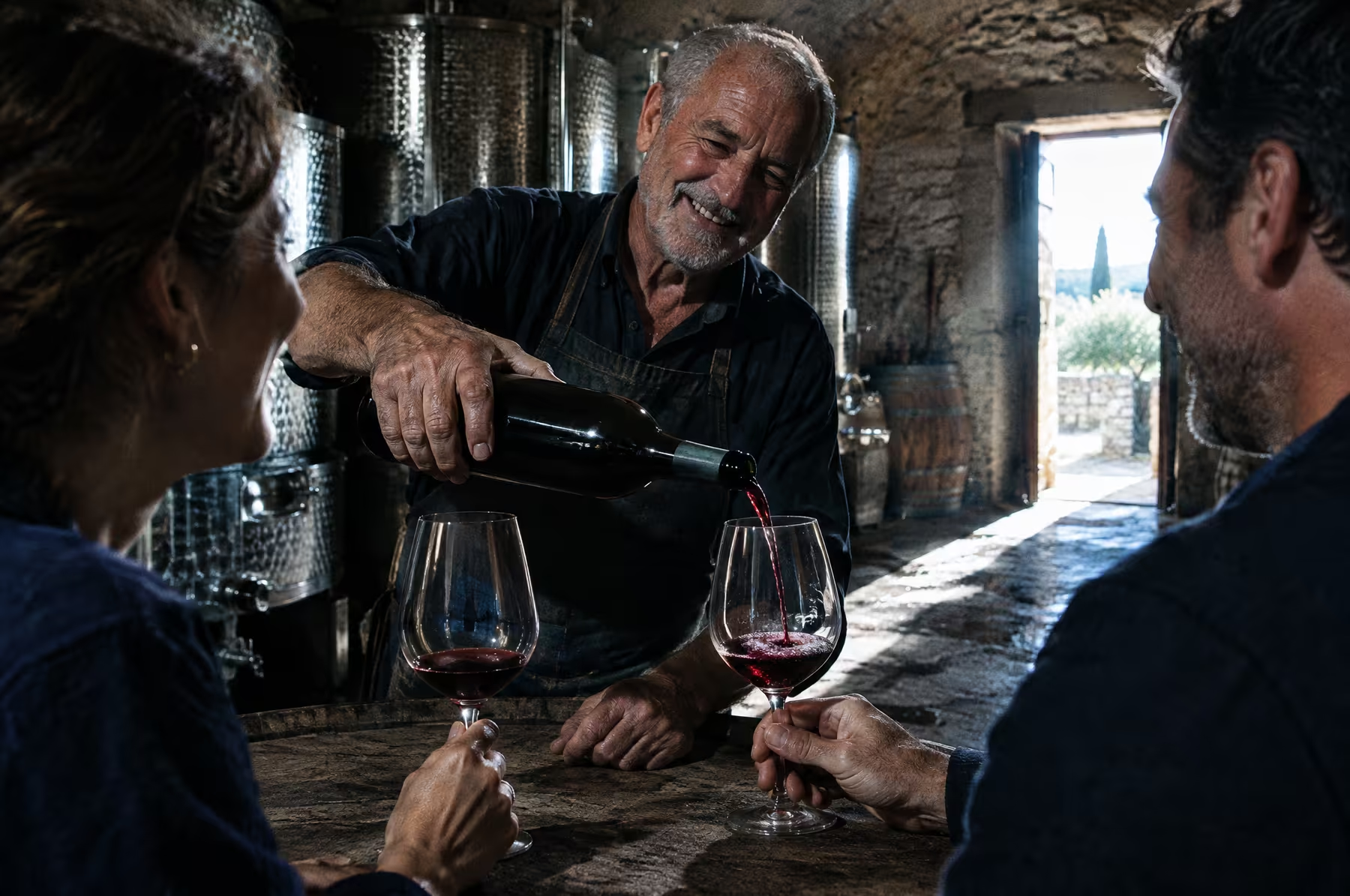
Àltera’s foundations come from Elena’s own answer to what makes a stay good. They guide the identity, the website and every printed object.
Room to be on your own, and a table to join when you want company.
Thick walls, dark nights, good linen. Nothing in the room competes with rest.
A seasonal kitchen built on the garden and on producers close to the gate.
Recommendations from someone whose taste you trust. Never a directory.
Service without formality. Being noticed, then left alone.
Fewer things, done properly. Eighteen rooms, one restaurant, one pool.
Free to change things without turning every decision into a brand exercise.
Puglia as a living place. Old and new held together, never nostalgic.
Brand Personality
and Voice
Àltera should feel like a cultured, observant host: slightly reserved at first, never cold, and generous once you arrive. Atmospheric when it helps, practical when it matters.
Brand Personality
- Cultured and curious
- Relaxed and observant
- Independent
- Generous
- Reserved at first, never cold
Brand Tone
- Direct and intelligent
- Atmospheric, never poetic about breakfast
- Practical information stays practical
- Specific rather than general
- Free of hospitality clichés
Audience &
Positioning
Audience
Design-conscious travellers from Europe, the UK and the US, roughly 30 to 55, who choose independent hotels for the point of view behind them. They value architecture, food, culture, privacy and places that feel specific. Italian couples and small groups from Milan, Rome, Bologna and Naples follow for long, food-led weekends.
Positioning
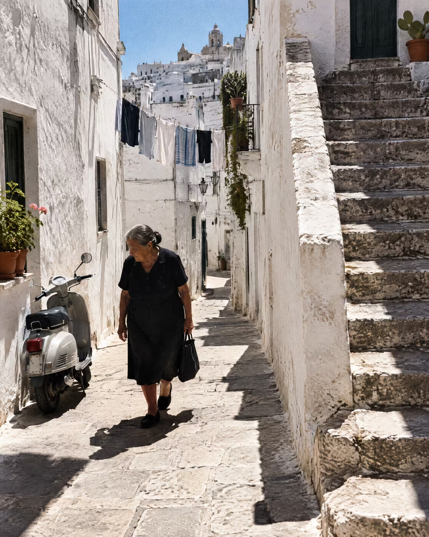
Design-led hotels across Puglia are starting to blur together. Àltera shows a Puglia that is contemporary without becoming cold, and local without becoming nostalgic.
Creative Strategy
02
From Brand Mission
to Visual Language
Defining how Àltera’s point of view becomes a visual identity with more personality, rhythm and contrast than the one it has today.
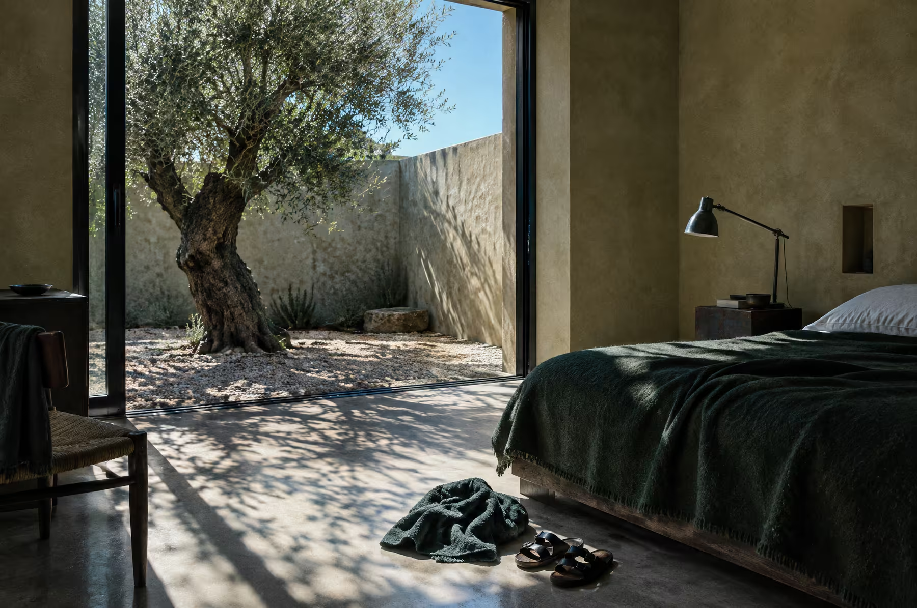
The brand follows the logic of the property: understand what is worth keeping, remove what is unnecessary, and add something new with precision.
Design Goals
What we aim to express through design
Architecture
Show food, people, landscape and the region, not only rooms.
Not Decorative
Personality and contrast that can sit beside warm photography.
the Postcard
No olive branches, arches, lemons or cream. Local, not nostalgic.
Made Obvious
Clear rates and reassurance, so booking here feels like the easy choice.
Design Strategy
The strategy outlines the key visual pillars of the brand. It defines the proposed aesthetic, colour approach, typography style and brand mood, so that every element works together.
The identity holds the same tensions as the buildings: restored stone beside precise new volumes, local and international, architectural but human. Designed, but never over-designed.
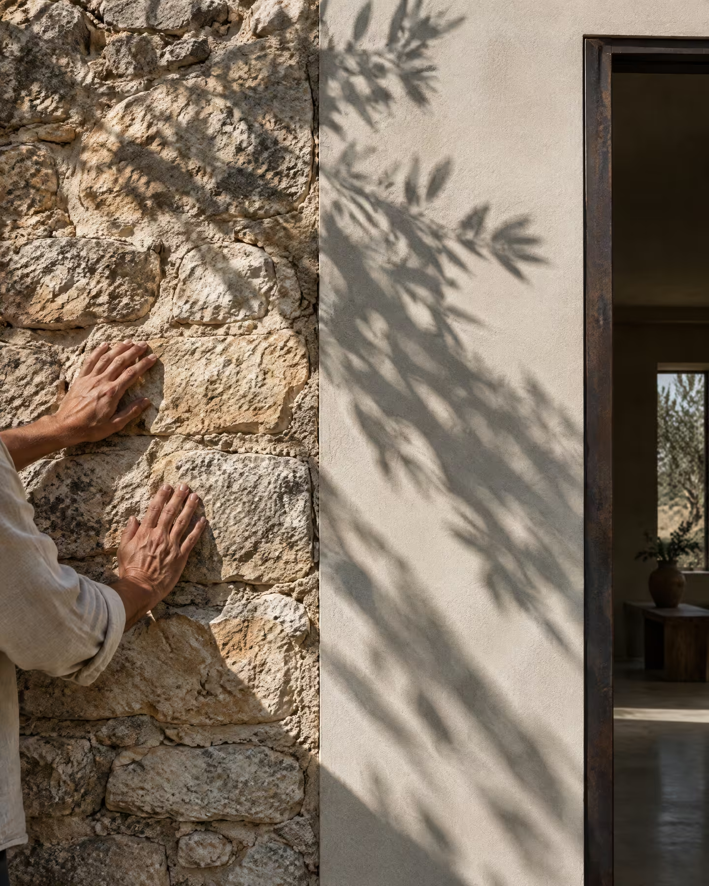
Cues from the property without copying it: stone, oxidised metal, dark green, blue-black, warm plaster, stainless steel and sun-faded colour. A few confident colours rather than ten earthy neutrals.
Typography that does not immediately read as hospitality: no romantic serif, no widely spaced capitals. A strong wordmark first; a symbol only if it earns its place.
The first reaction should be: I want to understand this place. The second: I know exactly how to get there and what I will find.
Mood &
Atmosphere
Logo
The current identity’s restraint is worth keeping. It is too neutral, though: it reads as if an architecture studio designed a hotel identity, which is roughly what happened.
For the logotype, we envision a strong wordmark with more personality, rhythm and contrast, confident enough to sit beside very warm photography without becoming decorative.
A secondary device only if it earns its place: a mark that is useful on a key, a menu or a sign, never an icon with a story invented afterwards.
The references are the brands Àltera admires, where the brand is present but never louder than the place.





Visual Direction
03
Approach
From Strategy to Visual Language
The following directions are three distinct interpretations of Àltera’s point of view.
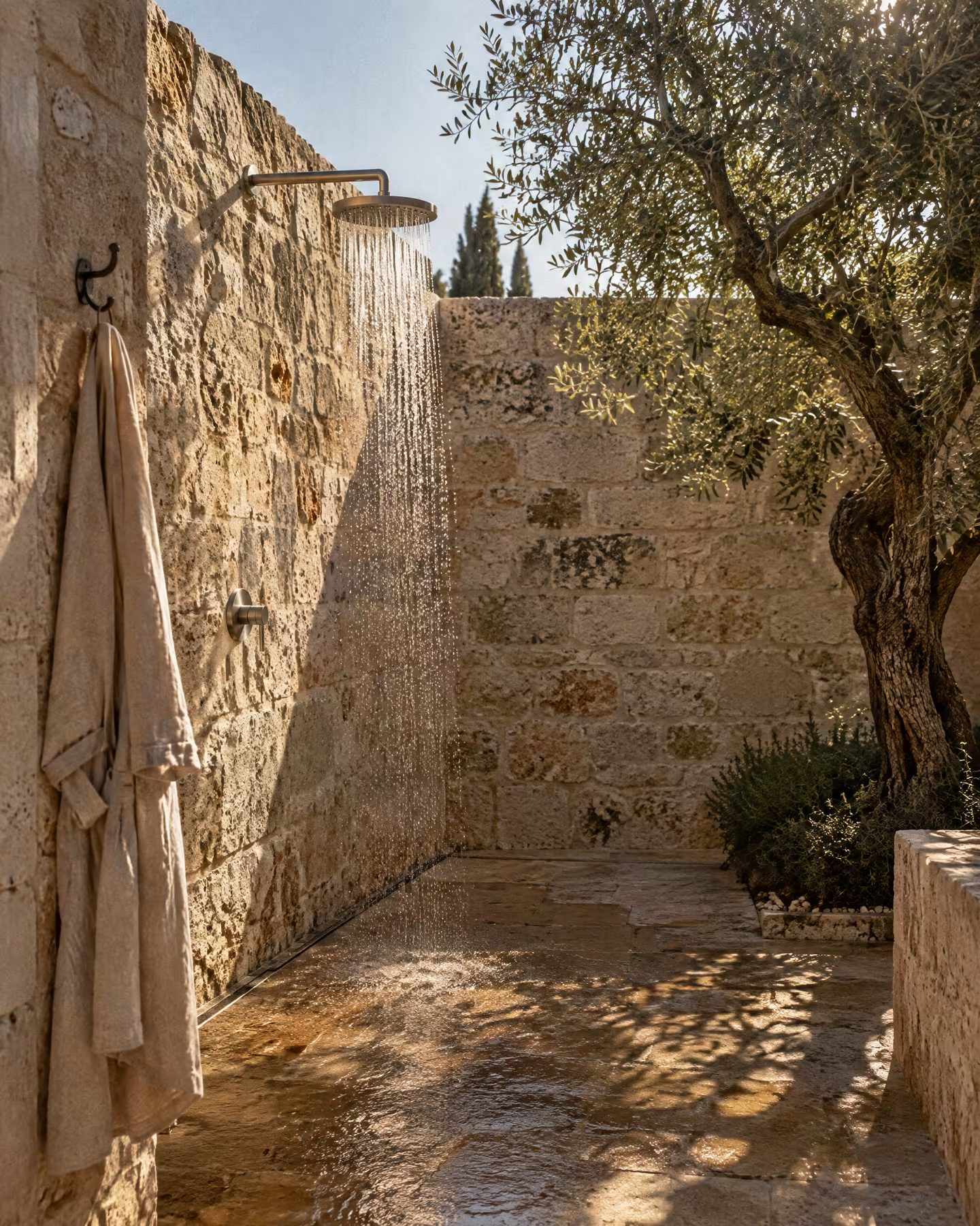
Each takes one side of the place and makes it the lead: the architecture and its materials, the table and the day outside, or the evening and the library. All three keep practical information clear and direct booking close.
Visual Directions
From the questionnaire, the scope of work and the brands Àltera admires, we have defined three creative directions.
The following slides present each visual direction individually
Direction 01
Stone & Steel
What was kept, and what was added, side by side.
Architectural / Precise / Tactile
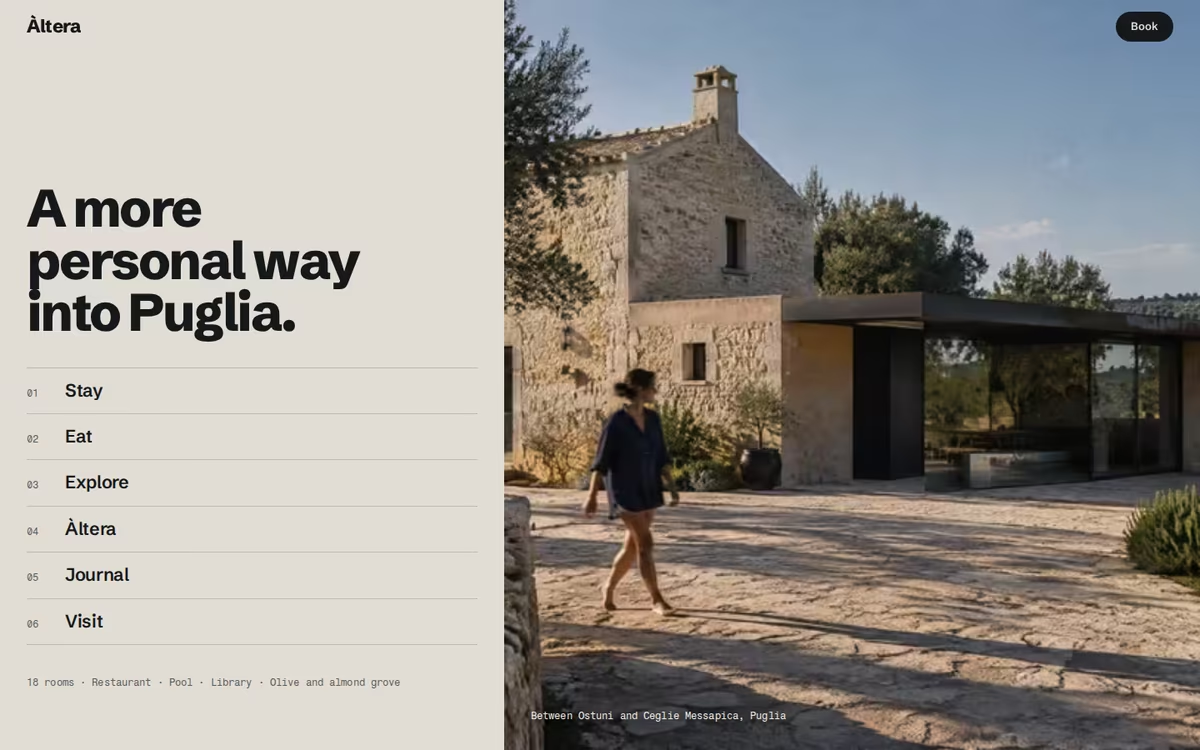
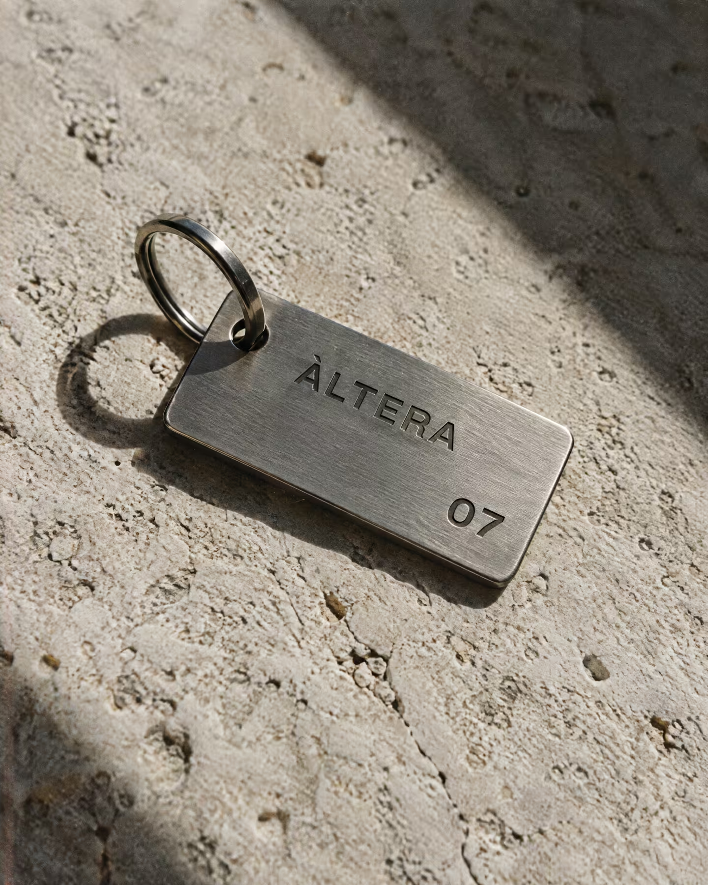
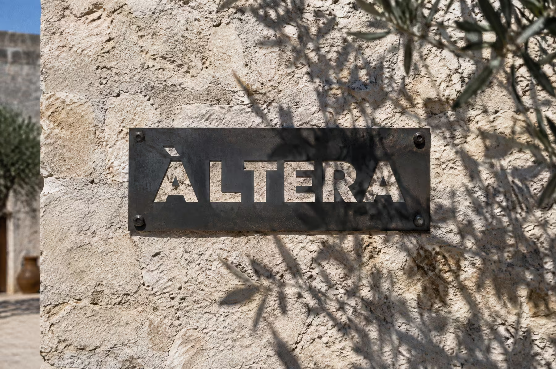
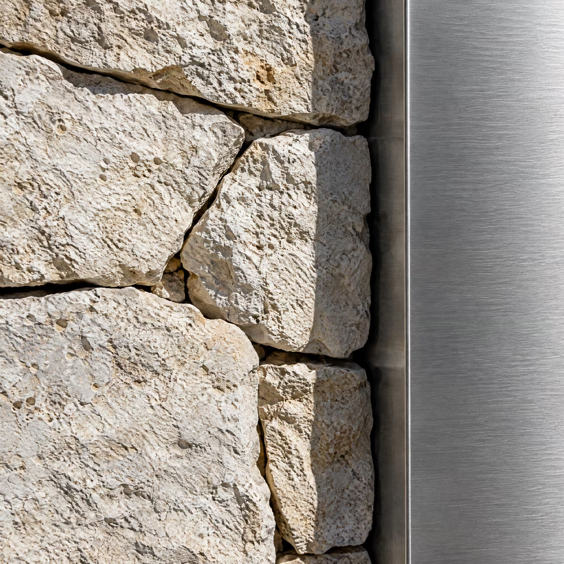
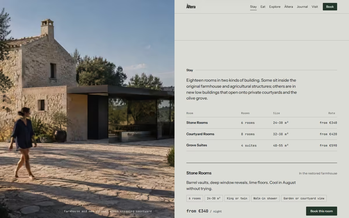
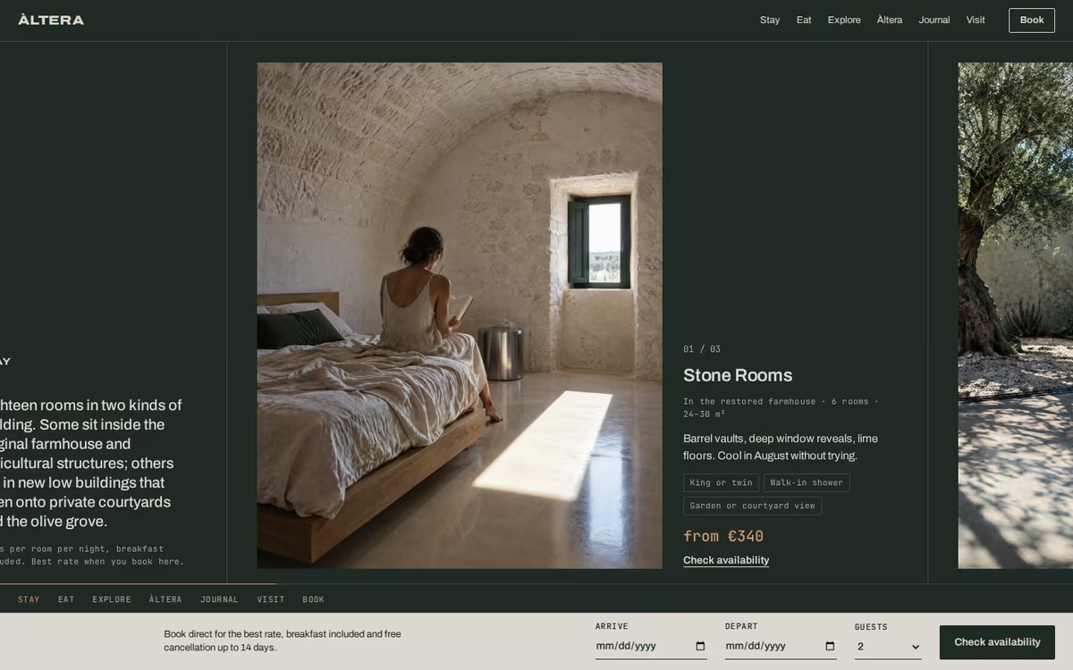
Takes the property’s own logic as the identity. Pale stone and lime plaster grounds, blue-black type, stainless steel and one oxidised accent. A heavy, tightly spaced grotesque wordmark engraved, cut and stamped into real materials. Architecture is always photographed with a person in it, in hard midday light.
Visual Cues
Lime plaster and stone grounds, heavy grotesque wordmark, monospaced details, numbered indexes, cut steel signage, engraved stainless keys, oxidised iron used once per page.
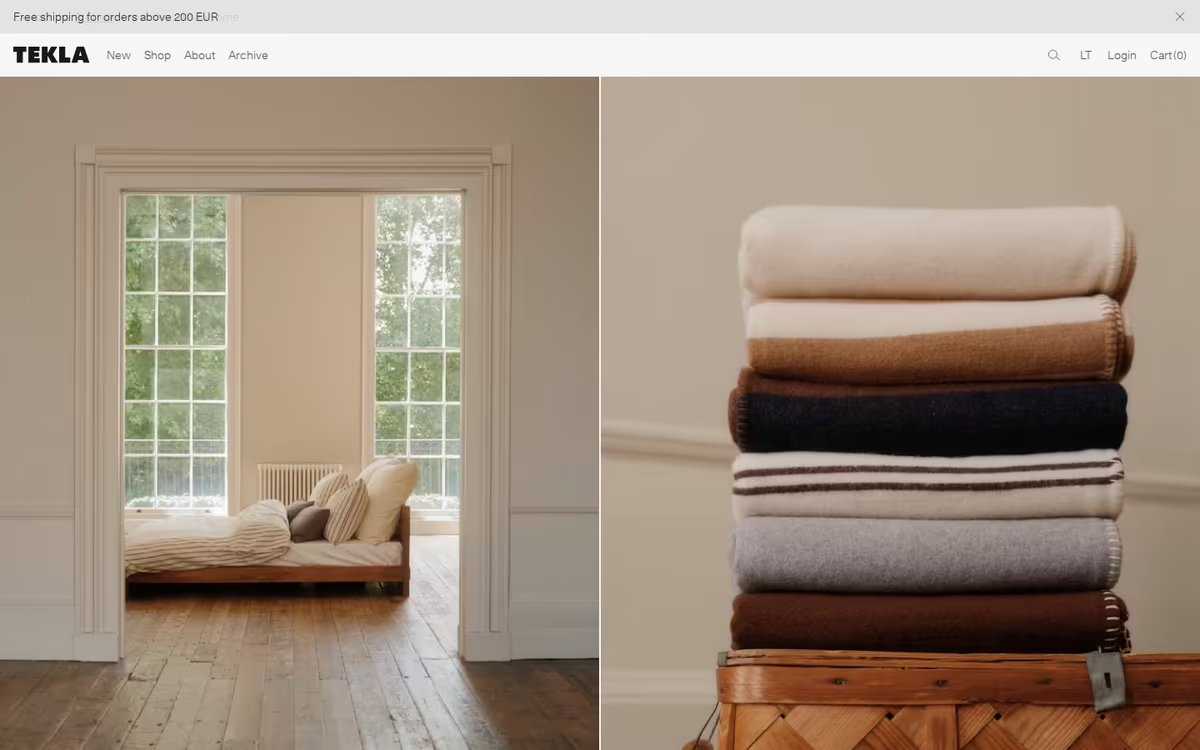
Similar Brands & Websites
- Tekla
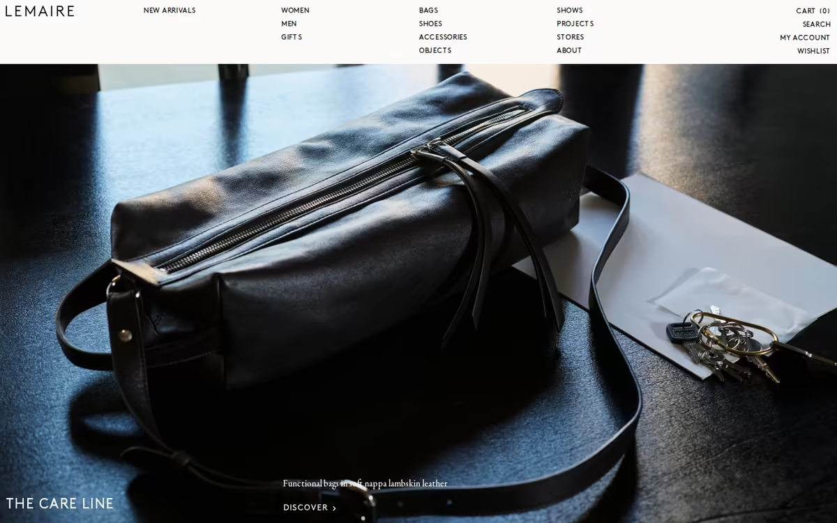
- Lemaire
- Holiday
Direction 1
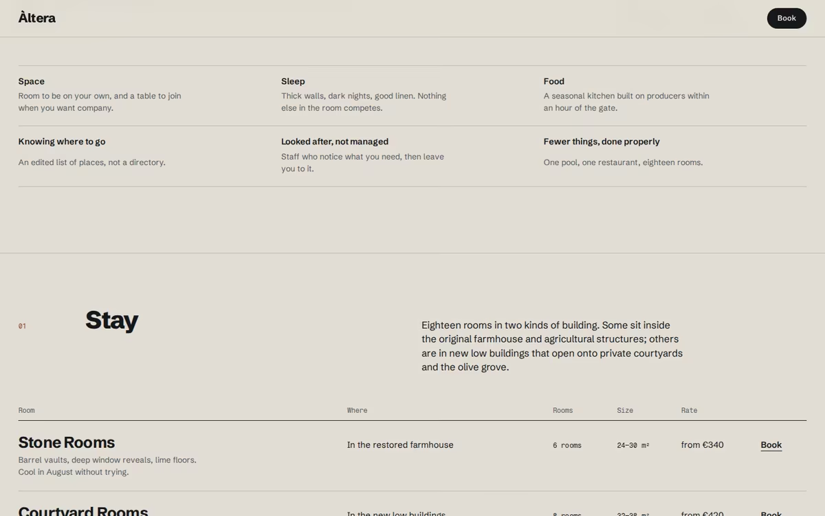
The wordmark lives in steel, stone and plaster before it lives on screen: keys, signs, stamped paper.
A contemporary grotesque with weight and no decoration, confident at every size.
Every building shot has someone in it, crossing, reading or swimming, in hard light.
Rust-red used once per page as the only colour, against stone and blue-black.
Direction 02
The Long Table
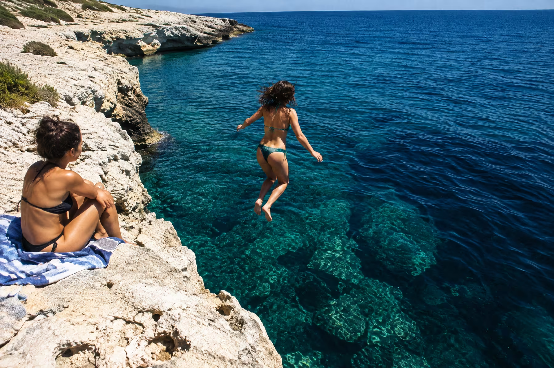
The day outside: food, heat, people and the sea.
Warm / Sociable / Sun-faded
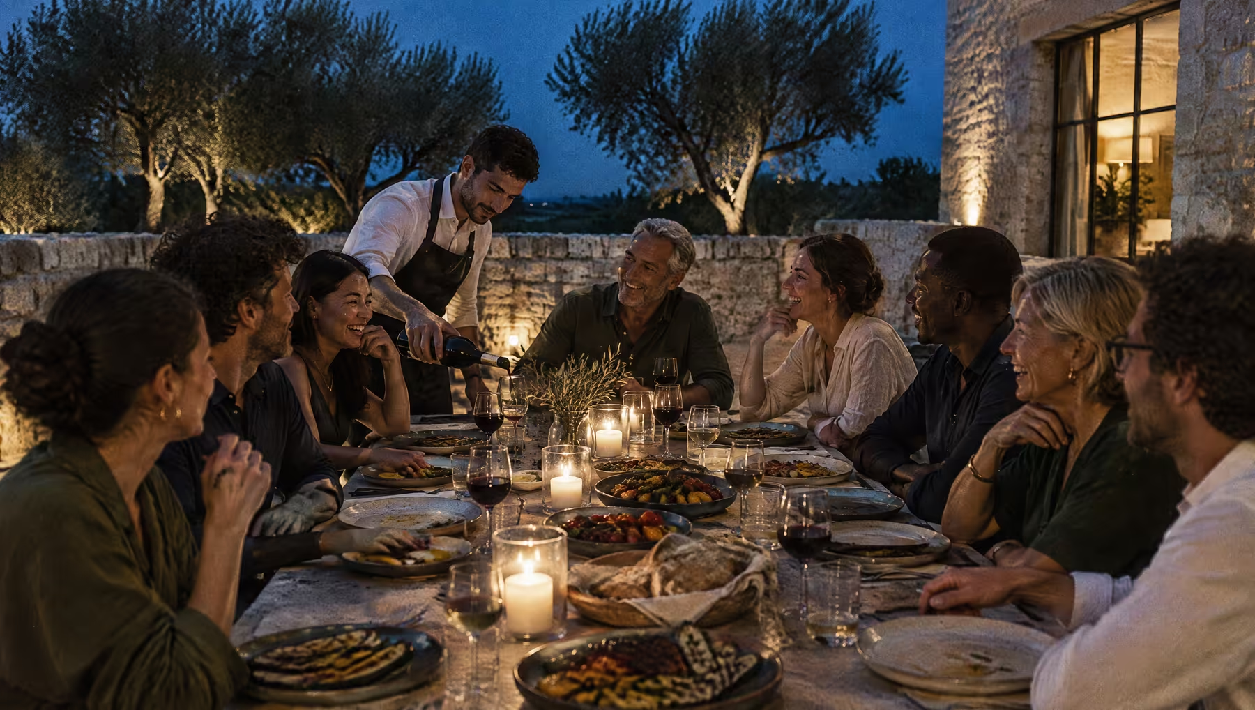
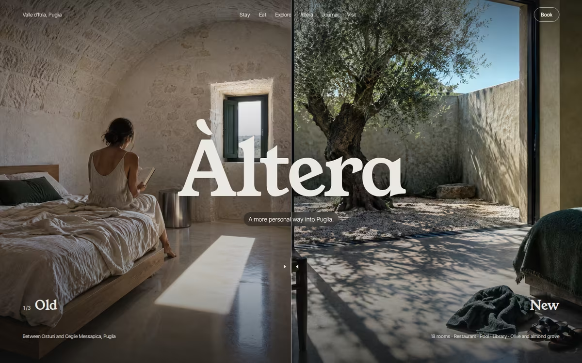
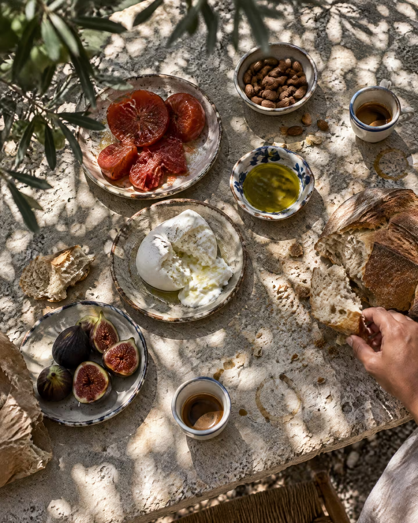
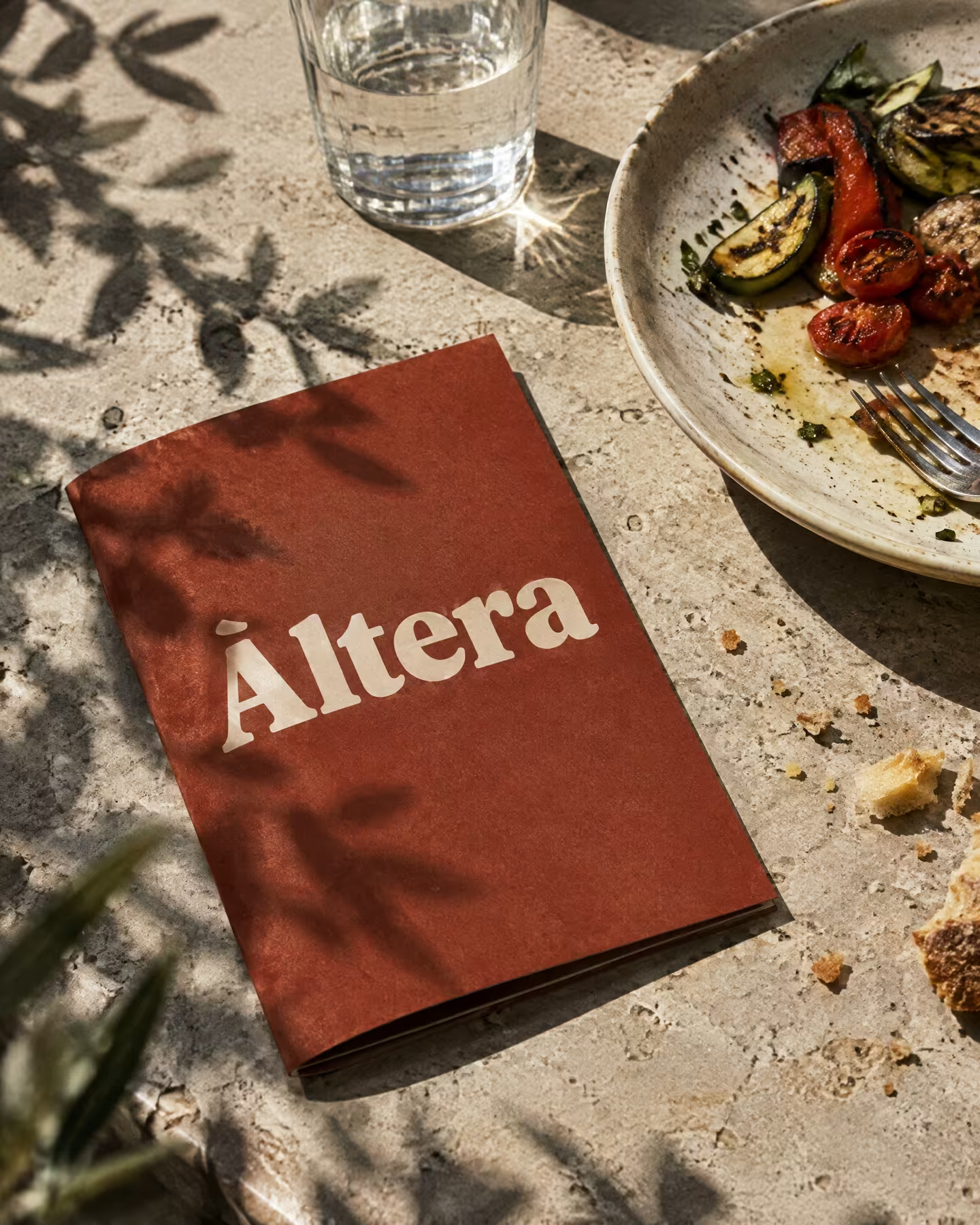
Leads with what guests fall for after they arrive: the table, the kitchen garden, producers, swimming spots, the long light of the afternoon. A cool paper ground with oxidised red and a sun-faded blue, and a chunky contemporary serif that is characterful rather than romantic. Printed matter feels like a small magazine you would keep.
Visual Cues
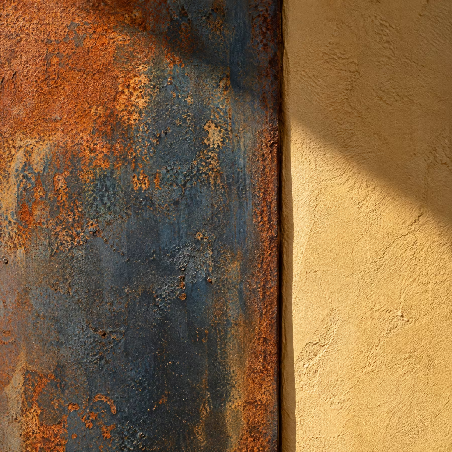
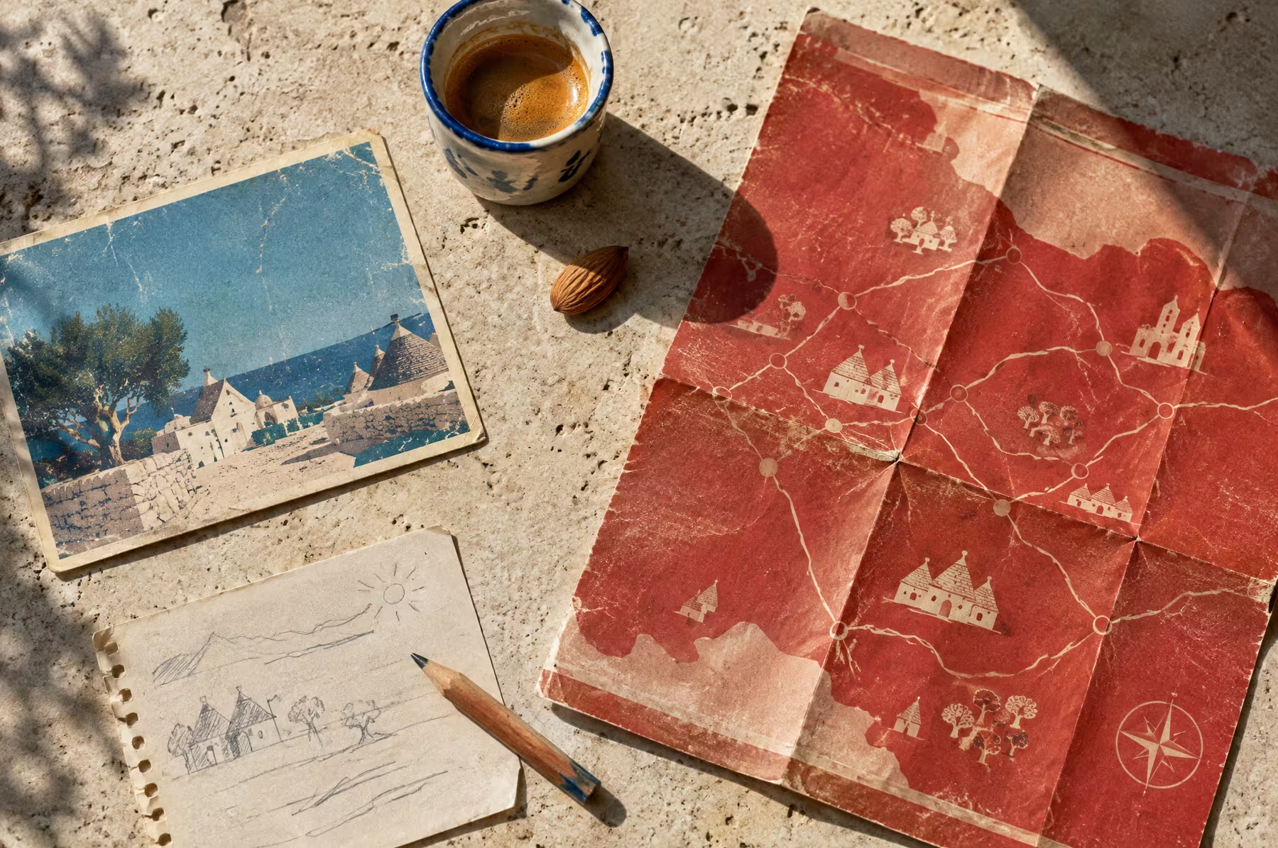
Oxidised red covers, sun-faded blue postcards, a heavy contemporary serif in small doses, candid food and hands photography, captions like a magazine, maps drawn in the kitchen.
Similar Brands & Websites
- Apartamento
- Cabana
- Holiday
Direction 2
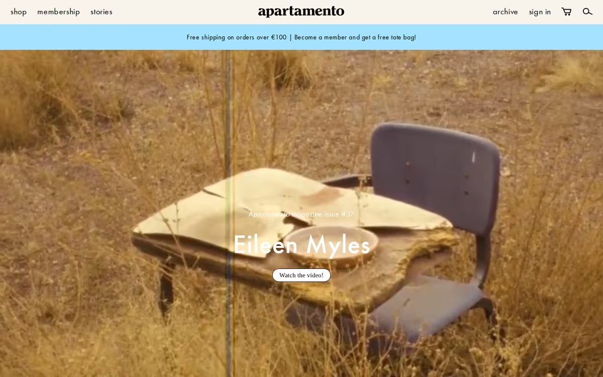
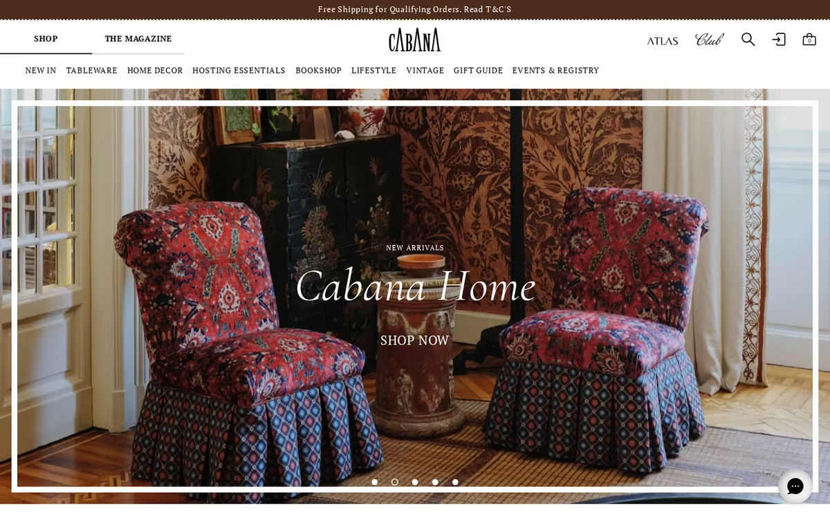
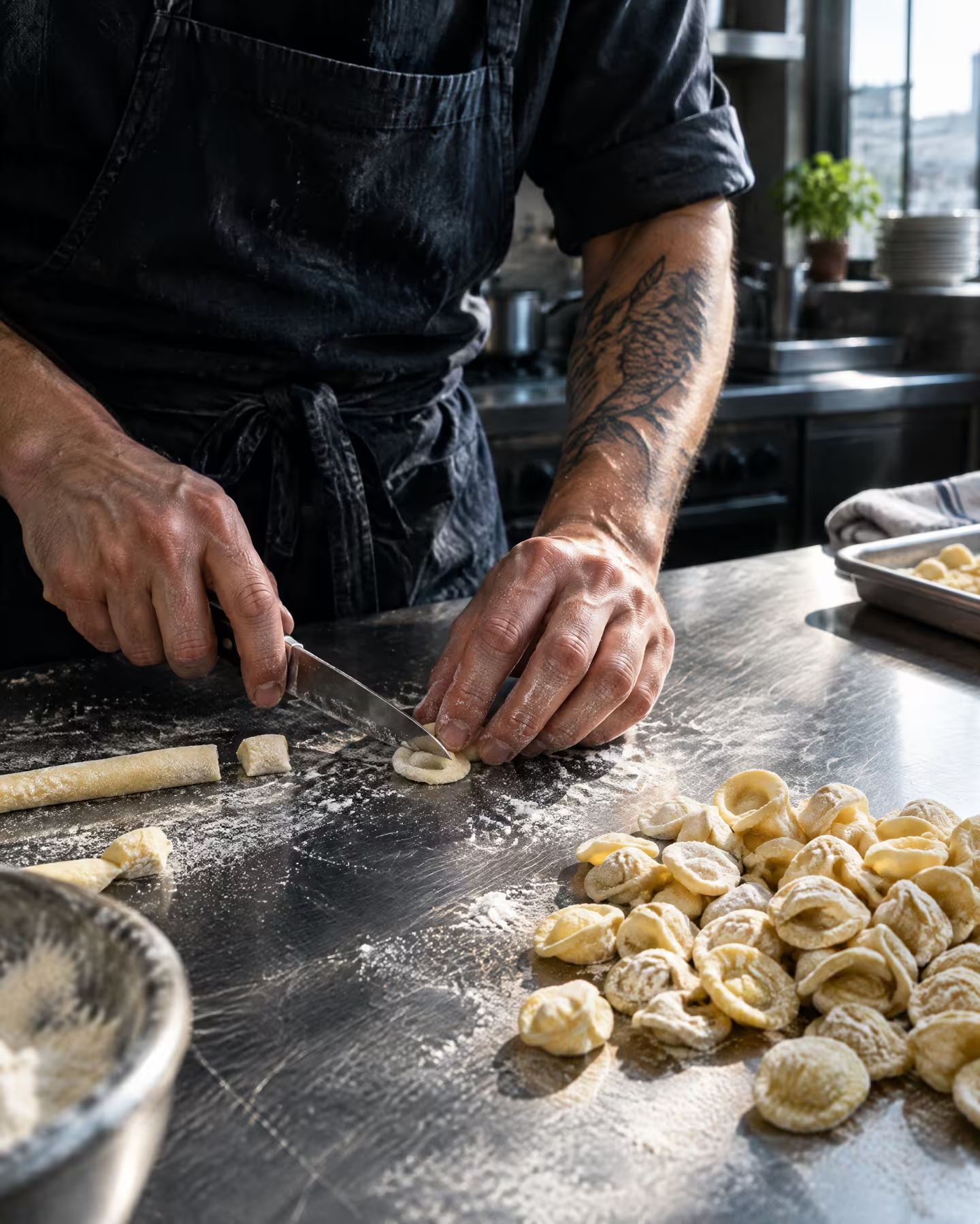
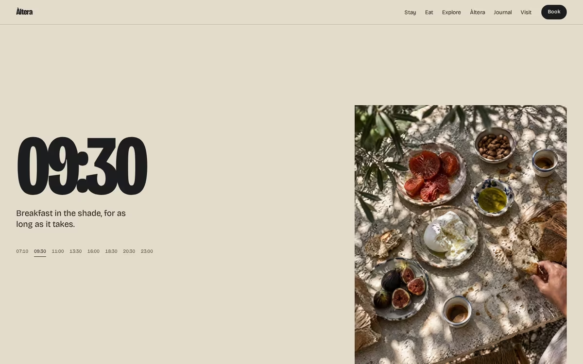
Candid, imperfect food photography: crumbs, flour, a hand reaching in. Never a styled flat lay.
A heavy contemporary serif used sparingly, closer to a magazine masthead than to a hotel crest.
Oxidised red and faded sea blue, the colours of things left out in the sun.
Menus, maps and the local guide made like a small independent magazine.
Direction 03
Green Hour
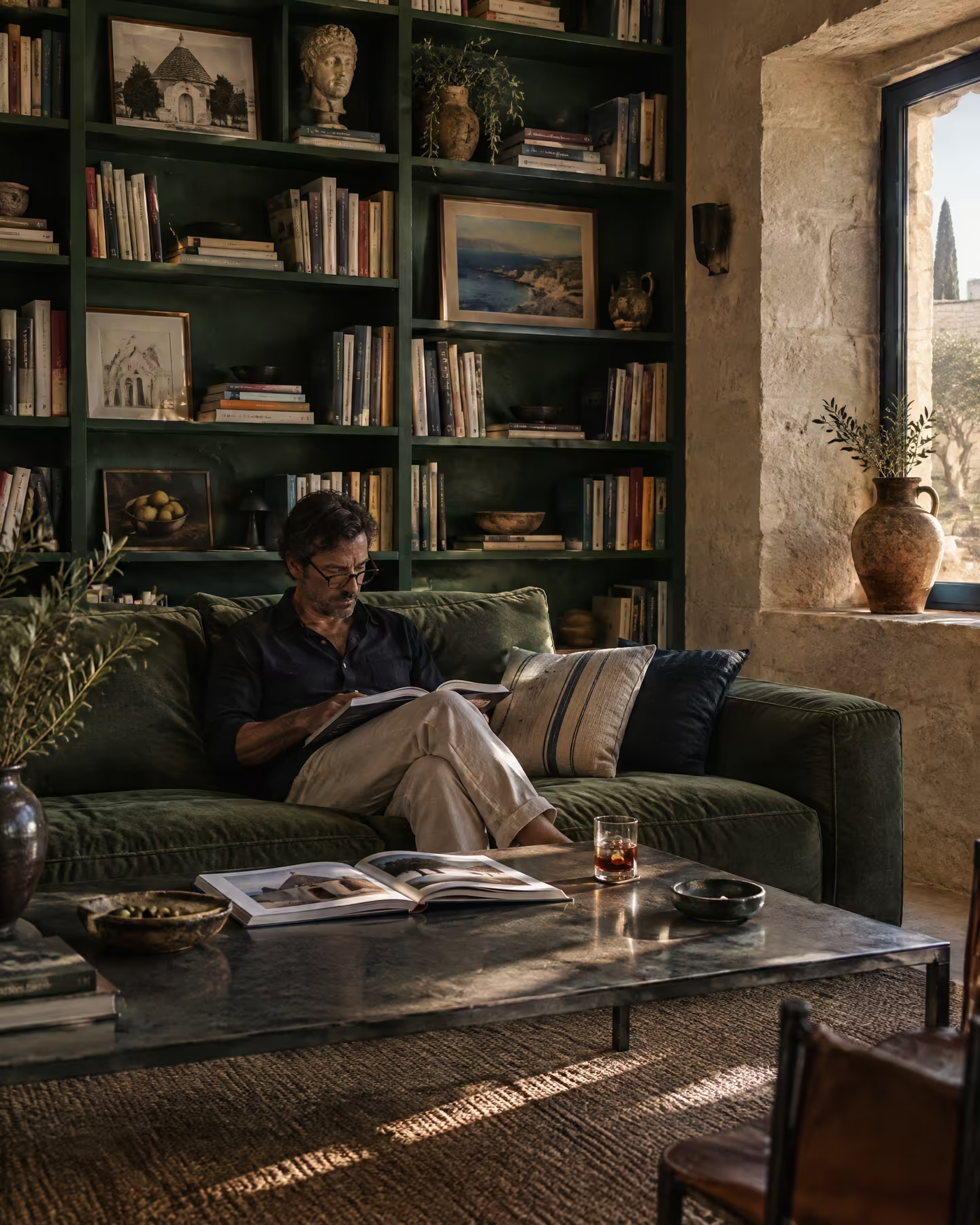
The evening, the library and a very dark night.
Nocturnal / Cultured / Reserved
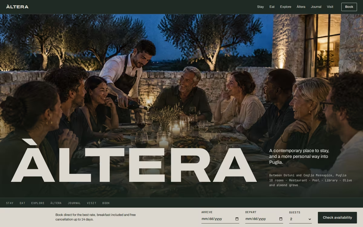
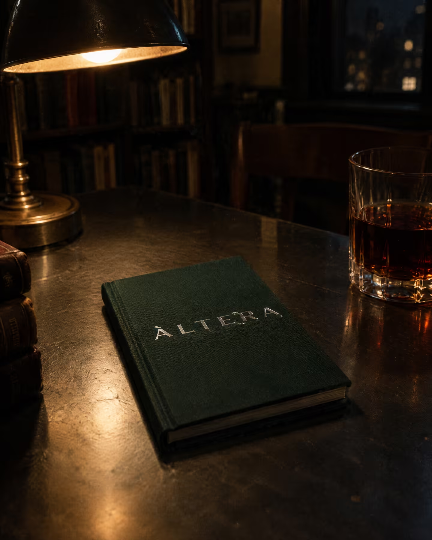
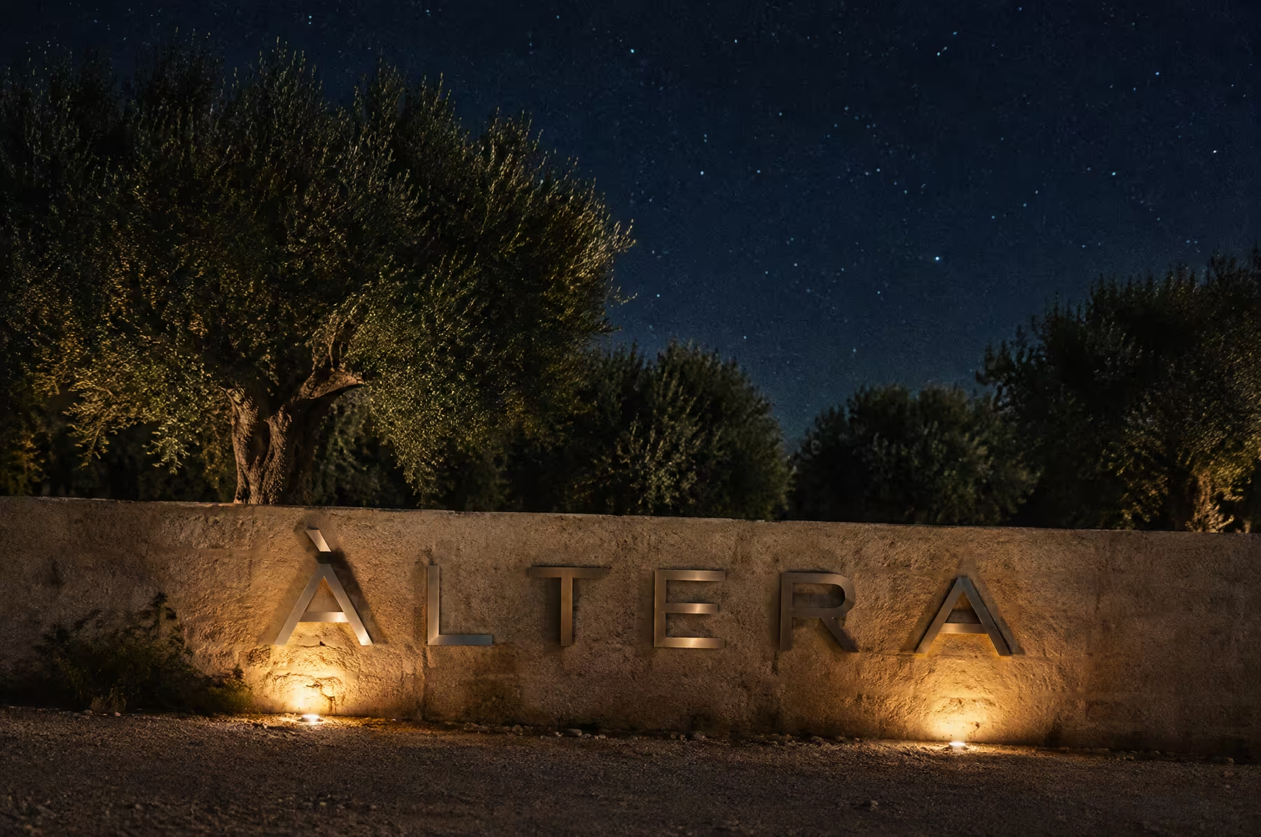
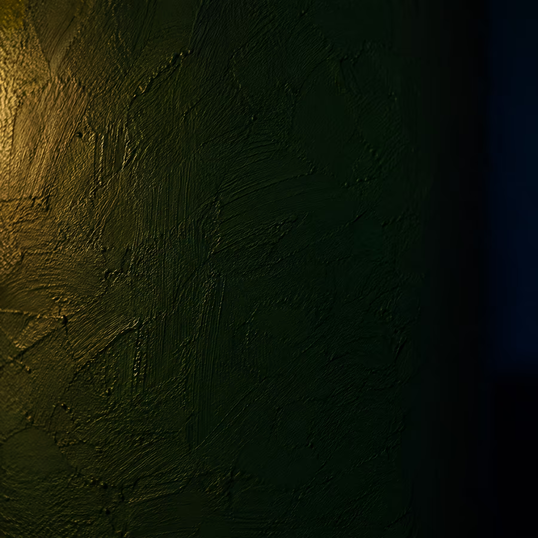
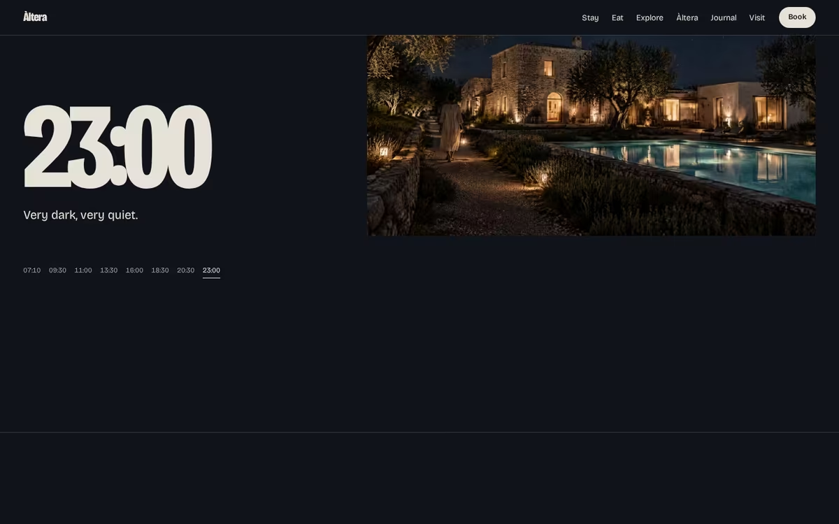
Takes Àltera’s reserved, cultured side and the moment after the heat: dinner at blue hour, the dark green library, a lit pool and a very quiet night. Deep green and blue-black grounds with stone type, brushed steel details and a wide, extended wordmark. Calm, cinematic and a little mysterious, with warm light as the only accent.
Visual Cues
Dark green and blue-black grounds, extended wordmark, silver foil on cloth, low warm light, blue-hour photography, a slow horizontal rhythm, film-like captions.
Similar Brands & Websites
- Lemaire
- Apartamento
- Tekla
Direction 3
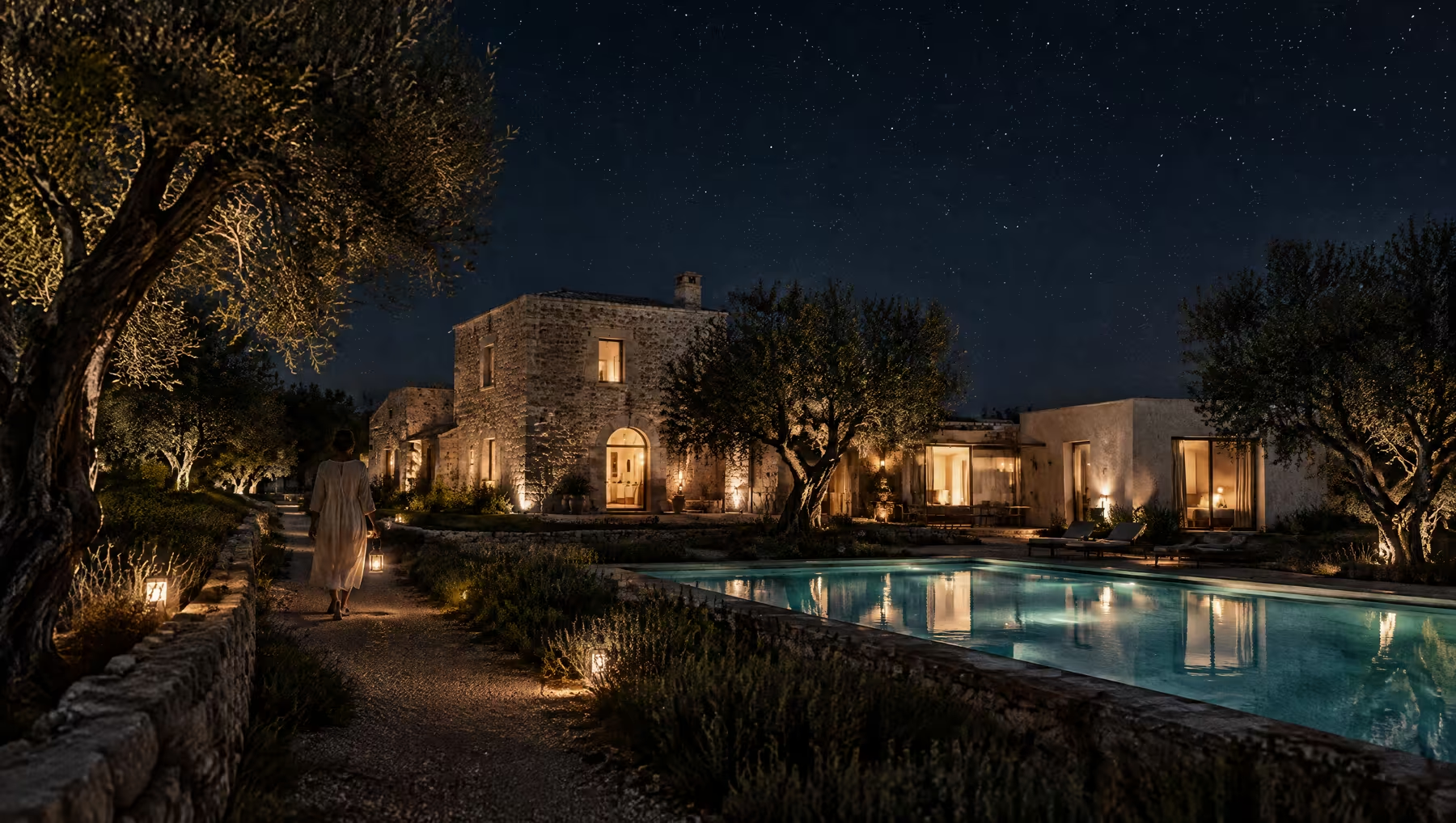
Dinner, the pool and the buildings after sunset, with warm light as the only colour.
A wide, calm wordmark that reads like a title card, in stone or brushed steel.
A green cloth-bound local guide, silver foil, steel lettering grazed by low light.
Very little on each page at first; the detail opens up the further you go.
Next Steps
04
Selecting
Moodboard
We have developed three distinct visual directions for Àltera, each rooted in the brand strategy while leading with a different side of the place: its materials and architecture, its table and its days, or its evenings and its reserve.
How to select
At this stage, the objective is to identify which direction feels most like the Àltera you are becoming. In particular:
- Which direction feels most like Àltera, rather than more Italian
- Whether the tone should lean more architectural, more sociable or more nocturnal
- How the typography, colour, imagery and overall visual language resonate
- Any elements you’d like us to develop further, refine or combine
To align on the preferred direction and next steps, we will arrange a call to review feedback in detail.
Following review and discussion of the creative directions, the next stage will focus on refining the selected pathway.
This will include:
- Defining the wordmark and any secondary device
- Defining the typography system
- Finalising the colour palette
- Photography and art direction principles
- Developing the brand visual system
We look forward to speaking soon and refining the direction together.